On Writing [and Editing]

Warning: rant ahead.

Probably most software developers have at least heard of Donald Knuth’s The Art of Computer Programming. Supposedly a 12-chapter book in seven volumes, the first volume was published in 1968 and we’re now partway through volume four (the fifth portion thereof expected to release in June). I’ve never read a significant amount of the work, but over the years I’ve occasionally dipped into it when researching a particular topic; it’s written as a reference book, and it works well for that.

I bring up these books not because they are particularly readable (they’re universally acknowledged as being quite dense, and very few people even claim to have read through them) or because of the speed with which they were written (although spending half a century on one project is impressive!) but because of Knuth’s dedication to getting the work exactly right. Aside from spending an astonishing amount of time on each book, he has long offered a reward of one hexadecimal dollar ($2.56) to anyone finding an error (including typos).

"Spellcheck" misspelled, with red underline

Most of us, of course, can’t put in that kind of effort (or time) to our writing. We (hopefully) have something to say, but there’s always the pressure to get it out there quickly and move on to the next project. I’ve seen more than a few programming blog posts that looked like they covered interesting material, but the writing was so bad that it wasn’t worth the effort to puzzle out what they were trying to say. (To be fair, many programmers have a first language other than English and deserve some leeway there). Books are even worse, due to the greater investment; I’ve given up on more than a few books due to the number of typos in the first chapter. Technical books, fortunately, seem to be better edited than most, but are by no means exempt from this problem.

Writing is meant to be read; make sure yours can be. If blog posts must be written quickly, consider cutting down on the number posted so as to take more care with each. When writing a more significant work, hire a good editor. My first book took only three weekends to write, but it was only 26 pages (of non-technical material) and still went through a round of editing before being published. I expect the book I’m working on now (which will be more technical) to take over a year to write and require several editors to make sure both the content and the language are correct. It still won’t be perfect; errors inevitably slip through no matter how many times you proofread (I’m still irritated over the one error I’m aware of in a graphic in my dissertation). But a focus on quality reflects well on you, and makes things easier for your readers.

I’m interested in what you have to say. Make it easy for me to hear it.

Usability: Multi-page articles

Ok, we get it. Banner ads are how you pay the bills for hosting your site, and the rate you can charge for them has been dropping year after year, which means you need to show more ads for the same amount of money. Which brings us to the latest trend: articles that could be all on one page, split up over 20 or 30 pages so that the user has to click next every couple of sentences (or even after one picture with a one-sentence caption).

The Page One extension for Chrome and Safari replaces the broken up pages for some popular sites with the single page version.

Stop doing this.

First off, it doesn’t work. Sure, some people are going to click through the entire article and you’ll get to show all 30 of your ads (otherwise you wouldn’t be doing this). Other people are going to click in, see the “page 1/30”, and click back. You got your one ad impression, just as if you’d put the entire article on one page, but you’ve also ticked off the user, who isn’t going to even think about linking to your content. Do it enough times, and users are likely to start actively blocking content from your site.

Second, it doesn’t work. If you’re irritating a large portion of your users this way, your click-through rates are going to drop, which means the amount you can charge for call to action banners will drop, which defeats the purpose of splitting up the article in the first place.

Third, it doesn’t work. Writing this post, I’m trying to recall what the last banner ad I saw was advertising…and I can’t. I don’t have an ad blocker installed (popups are another story); like most users, I just barely notice them. Even when I do, they’re generally either irrelevant or for something I already purchased – after I bought a cat tree a few years ago, I got advertisements for the model I’d picked (on the site I bought it from!) for the next month. Advertising can be useful to the user (and thus profitable for you) but random Google ads on a page with almost no relevant text probably aren’t.

If you have a 20,000 word article, fine, split it up into pages – that’s actually helpful in case I need to bookmark the page and come back later. But 20 words on a page? Throwing a big picture next to the words doesn’t excuse you for creating a poor usability experience.

Usability: On creating password rules

These days, everyone wants to make it clear that they’re taking security seriously. So they make each user create a password which contains at least eight characters including a lowercase letter, an uppercase letter, a number, a symbol, and some other rule that’s completely different from every other website. Then when you can’t remember your password (I know, I know, we should be using password managers and just remembering a master password) they show you the rules and make you set a new password, which can’t be the same as a previous password. Which means that next time you actually do remember your old password…

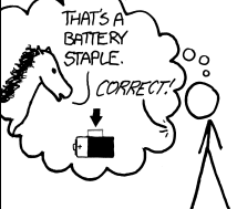
Panel from an xkcd comic about password strength.
xkcd is awesome. You should read it.

Minimum password lengths are a good idea. Expanding the character set is probably a good idea. But there’s actually a really easy way to improve usability and not tick off your customers. If I hit the “forgot password” link? Show me the password rules! I know my own thought processes; if I know what the rules are for choosing a password on your website, there’s a pretty good chance that I’ll immediately figure out what my password is rather than having to reset it with something that’s more difficult to remember. You’re not making things any easier for hackers, but you’re making it a lot easier for users.

Paying for Quality

Back in September, I listened to the Soft Skills: The Software Developer’s Life Manual audiobook, from John Sonmez of simpleprogrammer.com, and really enjoyed it. Except for one part, which ticked me off.Soft Skills book cover

In chapter 17, Resumes are BORING, John recommends hiring a professional resume writer to do your resume, under the assumption that this is a skill that you probably have never developed and it’s worth paying a few hundred dollars to get someone who really knows what they’re doing. So far, so good.

Then a few minutes later, when he’s talking about branding, he recommends going to Fiverr and having someone do your logo – the image that’s going to represent you for the foreseeable future – for $5. See the disconnect here?

Now, I have to admit to a bias – my wife is a multimedia designer, and the challenge she faces in finding new clients is exactly this: people who don’t appreciate the difference in quality between a professional designer and the type of person you can hire for $5 off fiverr or craigslist. It’s even worse for websites: too many business owners would rather buy a crappy template site for $100 from someone off craigslist than spend $1000+ for a professional site, even if the cheap site will end up turning away customers in the long run.

I wouldn’t describe myself as cheap, but I don’t like paying more for things than I have to either. When I’m shopping for non-food items for myself, I aim to get them for a least a quarter off. Yet, when I’m deciding what to purchase, quality is (within reason) a larger determinant than price. Why? Quality might cost more up front, but it saves you money (and will make you happier) in the long run. To take a geeky example, I’d rather have one copy of Food Chain Magnate (a VERY good $100 board game) than ten cheap games like Uno, Monopoly, etc; the high-quality game will provide more enjoyment over time.

Photo of the Epicurean garlic press
A $25 garlic press. Well-made tools pay for themselves in lack of hassle.

The same thing applies to services: you can’t (or at least, shouldn’t be able to) get services from an expert artist (or designer, or coder, or any other professional) for the cost of a cheap meal.

As software developers, we expect to be well paid for our expertise; shouldn’t we expect that other people who are also experts in their fields should want and deserve the same?

As professionals, we know that it’s more efficient for a company to hire us at a high rate to create a software package than to hire a college student with enthusiasm and a low hourly rate but without the experience or education to create the product that best meets the customer’s needs. Shouldn’t we express the same judgement when choosing services for ourselves?